Streamlining and launching a new course planning platform for 10,000+ students
Streamlining and launching a new course planning platform for 10,000+ students
Streamlining and launching a new course planning platform for 10,000+ students
Streamlining and launching a new course planning platform for 10,000+ students
The website is launched at melcourses.com, a web-based course planner that enables students to explore and plan classes ahead of Workday registration every semester.
The website is launched at melcourses.com, a web-based course planner that enables students to explore and plan classes ahead of Workday registration every semester.
Teammates
Teammates
8 Engineers, 3 Designers and 1 PM
8 Engineers, 4 Designers
8 Engineers, 3 Designers and 1 PM
8 Engineers / 3 Designers
Role
Role
Designer -> Design Lead
Designer -> Design Lead
Date
Date
Sep 2023 - May 2025
Sep 2023 - May 2025
Tools
Tools
Figma / HTML / CSS
Figma / HTML / CSS

IMPACT
IMPACT
IMPACT
Students, and faculty across the University of Rochester took advantage of our technology
Students, and faculty across the University of Rochester took advantage of our technology
2000+
2000+
Registered Rochester students on Melcourses
Registered students on Melcourses
46
46
Departments (Computer Science, Digital Media, etc) endorsed and funded the project
Departments endorsed and funded the project
6
6
Schools have used this website for their course planning and advising (Arts and Science, Simon Business School, UR Medical School...)
Schools used this website for academic advising
SO WHAT WAS THE PROBLEM?
SO WHAT WAS THE PROBLEM?
SO WHAT WAS THE PROBLEM?
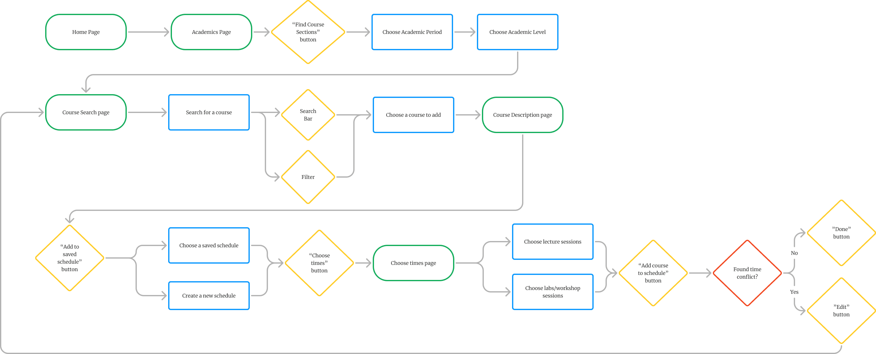
The past course-planning experience on the university's legacy tool was overly lengthy, and complex, requiring students 10+ steps to add a single class to the saved schedule
The past course-planning experience on the university's legacy tool was overly lengthy, and complex, requiring students 10+ steps to add a single class to the saved schedule
“Going through all this process is so annoying and daunting” - Student 1
“Going through all this process is so annoying and daunting” - Student 1
“Going through all this process is so annoying and daunting” - Student 1
“I hate course planning season. I don’t know why the university hasn’t created a more streamlined way to plan courses” - Student 2
“I hate course planning season. I don’t know why the university hasn’t created a more streamlined way to plan courses” - Student 2
“I hate course planning season. I don’t know why the university hasn’t created a more streamlined way to plan courses” - Student 2
User flow Break-Down 💀
User flow Break-Down
User flow Break-Down
THE PROBLEM
The past course-planning process on the university's legacy tool was overly lengthy, and complex, requiring students 10+ steps to add a single class to the saved schedule
“Going through all this process is so annoying and daunting” - Student 1
ON WORKDAY
User Flow Break-Down 💀
IMPACT
Students, faculty, and staff from across the University of Rochester took advantage of our technology
2000
Registered students on Melcourses
46
Departments endorsed and funded the project
6
Schools used this website for academic advising
How might we streamline the course-planning process in a 0-to-1 platform where students can quickly explore classes, and visualize their schedule for the semester?
How might we streamline the course-planning process in a 0-to-1 platform where students can quickly explore classes, and visualize their schedule for the semester?
How might we streamline the course-planning process in a 0-to-1 platform where students can quickly explore classes, and visualize their schedule for the semester?
How might we streamline the course-planning process in a 0-to-1 platform where students can quickly explore classes, and visualize their schedule for the semester?
SOLUTIONS
1 / Streamlined Course Description Viewing with Accordion Format
Designed an accordion menu that expands course details within the same page, letting students browse and compare options quickly without extra page navigation.
2 / Streamlined Course-to-Save Process
Improved and created a 3-click flow (browse → preview → save) using a dialog modal overlay. The modal provides real-time visibility into already saved courses, making the process faster and more transparent.
3/ Mobile Optimization
Led the design of the mobile web experience, optimized for students who primarily rely on their phone calendars.
DISCOVERY RESEARCH
DISCOVERY RESEARCH
Synthesizing findings from qualitative studies (n=16), college students nowadays share a preference for:
Synthesizing findings from qualitative studies (n=16), college students nowadays share a preference for:
Color Coding and Visualization
Color Coding and Visualization
9/16 of student members use tools like Notion and Google Calendar to color-code and visualize their course schedules.
9/16 of student members use tools like Notion and Google Calendar to color-code and visualize their course schedules.
Quick and bite-sized information
Quick and bite-sized info
As attention spans are shrinking, students prefer an intuitive experience without feeling overwhelmed by excessive information.
As attention spans are shrinking, students prefer an intuitive experience without feeling overwhelmed by excessive information.
Customization and Control
Students are eager to take control of the information they receive and enjoy actively engaging in viewing and planning their classes.
Accessible and easy planning process
Unlike traditional software design, modern student users prioritize ease of use, favoring tools with minimal learning curves.
Customization and Control
Students are eager to take control of the information they receive and enjoy actively engaging in planning their classes.
Easy planning process
Unlike traditional software design, modern student users prioritize ease of use, favoring tools with minimal learning curves.
USER FLOW
Before designing, the former design lead and I ran a FigJam sprint to map a new course-planning user flow, reducing redundant pages and screens into a clear four-step experience
Research showed that students’ primary goals are searching for courses, viewing course details, selecting courses to add, and visualizing them on a calendar.
Before
After
FROM LOW TO HIGH FIDELITY PROTOTYPE
FROM LOW TO HIGH FIDELITY PROTOTYPE
FROM LOW TO HIGH FIDELITY PROTOTYPE
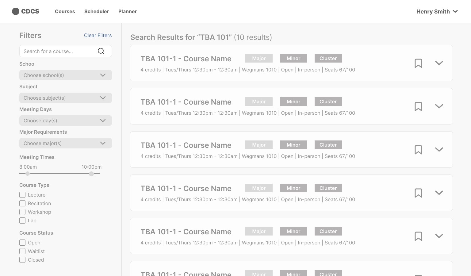
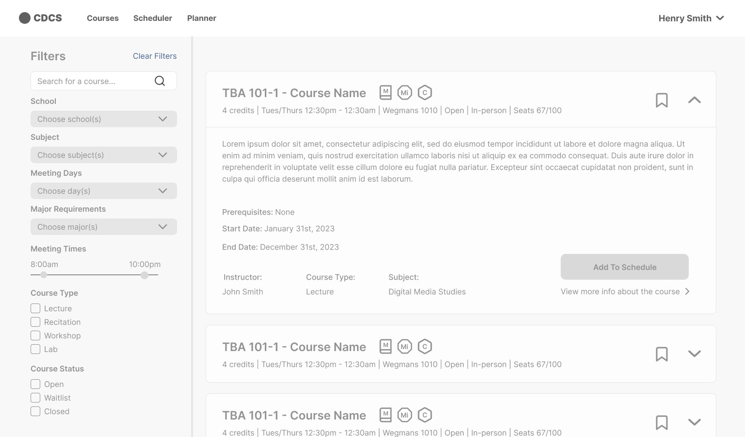
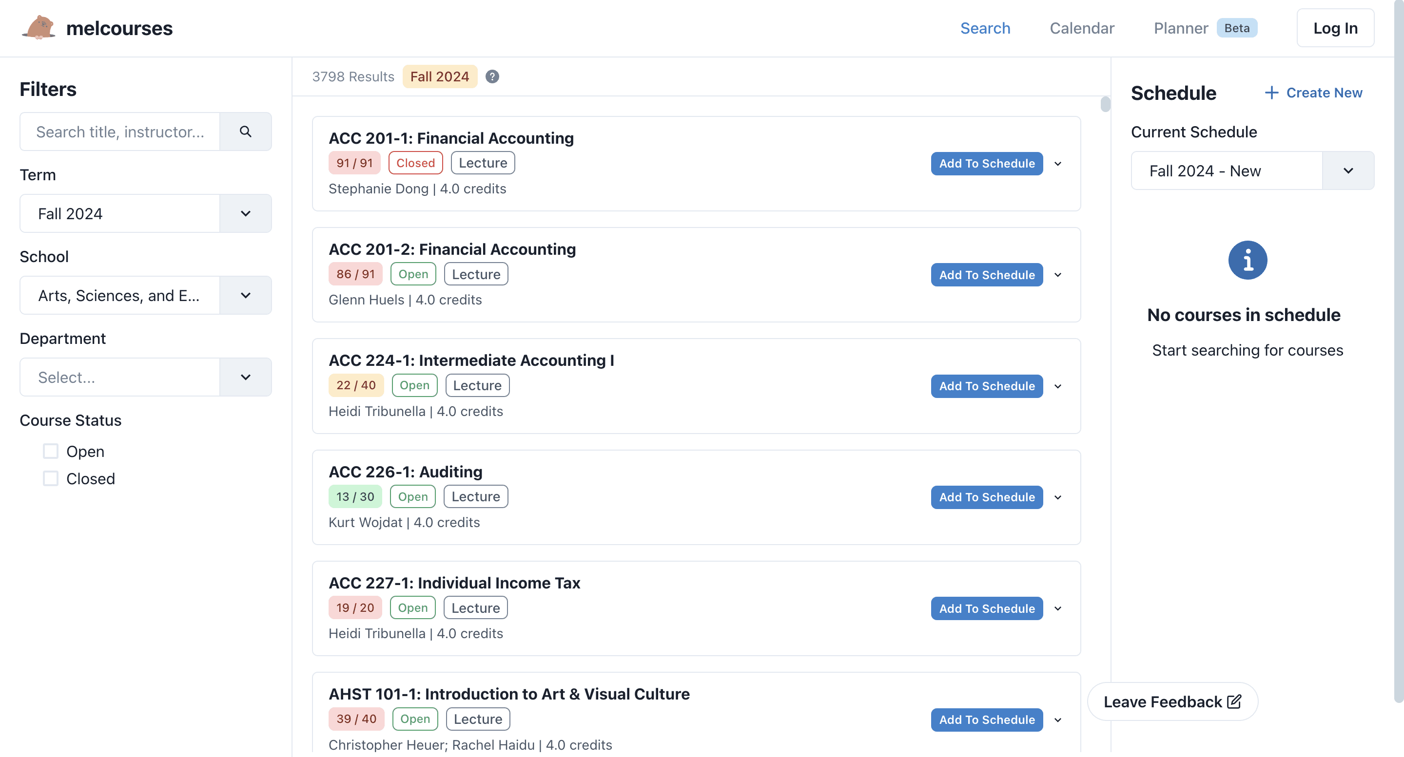
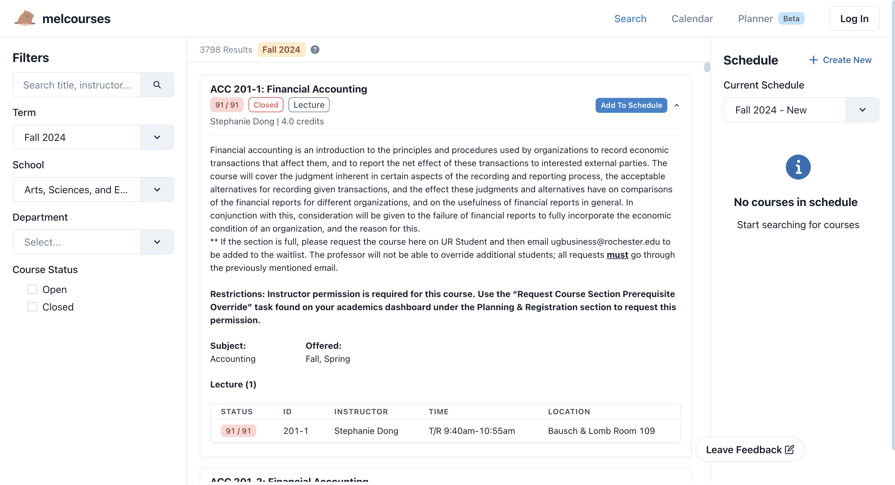
Implementing the accordion layout for viewing course descriptions
Implementing the accordion layout for viewing course descriptions
When students are browsing classes, they want to quickly scan key details - like the course description, instructor, credits, meeting times, and prerequisites—without having to click through a bunch of separate pages. To make that process smoother, an accordion layout is used to surface all the essential info in one place.
When students are browsing classes, they want to quickly scan key details - like the course description, instructor, credits, meeting times, and prerequisites—without having to click through a bunch of separate pages. To make that process smoother, an accordion layout is used to surface all the essential info in one place.
When students are browsing classes, they want to quickly scan key details - like the course description, instructor, credits, meeting times, and prerequisites—without having to click through a bunch of separate pages. To make that process smoother, an accordion layout is used to surface all the essential info in one place.
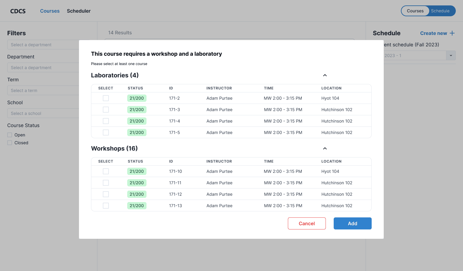
But how can we streamline the process of selecting lectures and labs without sending students to another page like on Workday?
A/B TESTING
Option A: Using a dialog modal is the most effective solution for streamlining the process of adding lectures and labs to a schedule, resulting in the shortest task time and highest user satisfaction.
I developed two concepts to streamline the course selection and scheduling processes. Following that, I conducted A/B testing with users to determine which option allowed them to complete the tasks in the least amount of time.
Option A
Pop-up Dialog Modal to select labs and workshops
Option B
Drop-down menu to select labs and workshops
Option A
Pop-up Dialog Modal
Option B
Drop-down menu selection
Average Task time
8 seconds
18 seconds
Satisfaction Rate
9.5/10
6/10
Qualitative Feedback
“Wow I love how it pops up here instead of leading me to a different page”
“After picking the workshops and labs, I have to scroll back up to add the class to the schedule, which is kind of annoying and time-consuming”
FEEDBACK
Despite the high satisfaction rate, users still express frustration with the dialog design because they cannot see whether newly added courses conflict with their saved schedule.
Throughout a usability testing sessions, there is a general theme that comes up regarding the visibility of the saved schedule and a desire for a preview mode


ITERATION
Informed by user feedback, I facilitated another design sprint to redesign the dialog modal with a schedule preview, helping students visualize their timetable and identify conflicts.
“I love how it’s pop-up screen instead of leading you to another page” - User 1
“I love how I can see if I had any time conflict right when I select the courses. This is really thoughtful design” - User 2
After realizing that most students prefer checking their schedule on their phones, I and another IC Kyle teamed up to debate, explore and redesign the mobile experience, using a bottom sheet to replace the modal.
“This looks so professional. Almost like Google Calendar which I love ” - User 1
DISCOVERY RESEARCH
Synthesizing findings from qualitative studies (n=16), college students nowadays share a preference for:
Color Coding and Visualization
9/16 of student members use tools like Notion and Google Calendar to color-code and visualize their course schedules.
Quick and bite-sized information
As attention spans are shrinking, students prefer an intuitive experience without feeling overwhelmed by excessive info.
Customization and Control
Students are eager to take control of the information they receive and enjoy actively engaging in viewing and planning their classes.
Accessible and easy planning process
Unlike traditional software design, modern student users prioritize ease of use, favoring tools with minimal learning curves.
USER FLOW
Before designing, the former design lead and I ran a FigJam sprint to map a new course-planning user flow, reducing redundant pages and screens into a clear four-step experience
Research showed that students’ primary goals are searching for courses, viewing course details, selecting courses to add, and visualizing them on a calendar.
Before
After
LEARNINGS
In this collaborative project, I learnt:
Design leadership
As the lead designer and team lead, I focused on honing my craft and growing my team, designing high-fidelity mockups, unblocking broader team's design problems, and challenging decisions.
Design system craftmanship and detail
Creating reusable, scaleable, and consistent design elements taught me the importance of forward-thinking in design—anticipating future needs and ensuring the system could accommodate them.
Involving engineers in the design process
Having engineers early in the loop to identify technical constraints, test design concepts, and implement feasible solutions was very valuable.
OTHER UX PROJECTS

LEARNINGS
In this collaborative project, I learnt:
Design system craftmanship
Creating reusable, scaleable, and consistent design elements taught me the importance of forward-thinking in design—anticipating future needs and ensuring the system could accommodate them.
Involving engineers in the design process
Having engineers early in the loop to identify technical constraints, test design concepts, and implement feasible solutions was very valuable.
Design leadership
As the lead designer and team lead, I focused on honing my craft and growing my team, designing high-fidelity mockups, unblocking broader team's design problems, and challenging decisions.
A/B TESTING
Option A: using a dialog modal is the most effective solution for streamlining the process of adding lectures and labs to a schedule, with the shortest task time and a high satisfaction rate.
I developed two concepts to streamline the course selection and scheduling processes. Following that, I conducted A/B testing with users to determine which option allowed them to complete the tasks in the least amount of time.
Option A
Pop-up Dialog Modal to select labs and workshops
Option B
Drop-down menu to select labs and workshops
Option A
Pop-up Dialog Modal
Option B
Drop-down menu
Average Task time
8 seconds
18 seconds
Satisfaction Rate
9.5/10
6/10
Qualitative Feedback
“Wow I love how it pops up here instead of leading me to a different page”
“After picking the workshops and labs, I have to scroll back up to add the class to the schedule, which is kind of annoying and time-consuming”
FEEDBACK
Despite the high satisfaction rate, users still express frustration with the dialog design because they cannot see whether newly added courses conflict with their saved schedule.
Throughout a usability testing sessions, there is a general theme that comes up regarding the visibility of the saved schedule and a desire for a preview mode
ITERATION
Informed by user feedback, I facilitated another design sprint to redesign the dialog modal with a schedule preview, helping students visualize their timetable and identify conflicts.
“I love how it’s pop-up screen instead of leading you to another page” - User 1
“I love how it’s pop-up screen instead of leading you to another page” - User 1
“I love how I can see if I had any time conflict right when I select the courses. This is really thoughtful design” - User 2
“I love how I can see if I had any time conflict right when I select the courses. This is really thoughtful design” - User 2
After realizing that most students prefer checking their schedule on their phones, I and another IC Kyle partnered to debate, explore and redesign the mobile experience, using a bottom sheet to replace the modal.
“This looks so professional. Almost like Google Calendar which I love ” - User 1
“This looks so professional. Almost like Google Calendar which I love ” - User 1
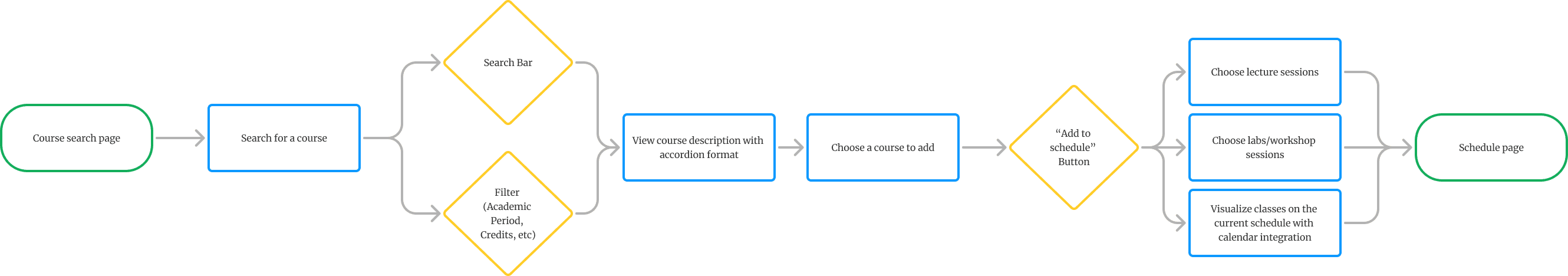
Final User Flow
A streamlined 4-step user flow with a clear start and end
Before
After
Final User Flow
A streamlined 4-step user flow with a clear start and end
Before
After
Final User Flow
A streamlined 4-step user flow with a clear start and end
Before
After
Final User Flow
A streamlined 4-step user flow with a clear start and end
We cut redundant steps to significantly save users time and boost overall efficiency.
Before
After
But how can we streamline the process of selecting lectures and labs without sending students to another page like on Workday?
SOLUTIONS
1 / Streamlined Course Description Viewing with Accordion Format
Designed an accordion menu that expands course details within the same page, letting students browse and compare options quickly without extra page navigation.
2 / Streamlined Course-to-Save Process
Improved and created a 3-click flow (browse → preview → save) using a dialog modal overlay. The modal provides real-time visibility into already saved courses, making the process faster and more transparent.
3/ Mobile Optimization
Led the design of the mobile web experience, optimized for students who primarily rely on their phone calendars.
But how can we streamline the process of selecting lectures and labs without sending students to another page like on Workday?
A/B TESTING
Option A: using a dialog modal is the most effective solution for streamlining the process of adding lectures and labs to a schedule, with the shortest task time and a high satisfaction rate.
I developed two concepts to streamline the course selection and scheduling processes. Following that, I conducted A/B testing with users to determine which option allowed them to complete the tasks in the least amount of time.
Option A
Pop-up Dialog Modal to select class sections
Option B
Drop-down menu to select class sections
FEEDBACK
Despite the high satisfaction rate, users still express frustration with the dialog design because they cannot see whether newly added courses conflict with their saved schedule.
Throughout a usability testing sessions, there is a general theme that comes up regarding the visibility of the saved schedule and a desire for a preview mode
ITERATION
Informed by user feedback, I facilitated another design sprint with my team to redesign the dialog modal with a schedule preview, helping students visualize their timetable and identify conflicts.
“I love how it’s pop-up screen instead of leading you to another page” - User 1
“I love how I can see if I had any time conflict right when I select the courses. This is really thoughtful design” - User 2
After realizing that most students prefer checking their schedule on their phones, I and Kyle partnered to debate, explore and redesign the mobile experience, using a bottom sheet to replace the modal.
“This looks so professional. Almost like Google Calendar which I love ” - User 1
LEARNINGS
In this collaborative project, I learnt:
Design system craftmanship
Creating reusable, scaleable, and consistent design elements taught me the importance of forward-thinking in design—anticipating future needs and ensuring the system could accommodate them.
Involving engineers in the design process
Having engineers early in the loop to identify technical constraints, test design concepts, and implement feasible solutions was very valuable.
People management and leadership
As the lead designer and people manager, I focused on growing my team - unblocking design problems, challenging design decisions, and advocating for them in cross-functional spaces.
OTHER UX PROJECTS
OTHER UX PROJECTS

SOLUTIONS
1 / Streamlined Course Description Viewing with Accordion Format
Designed an accordion menu that expands course details within the same page, letting students browse and compare options quickly without extra page navigation.
2 / Streamlined Course-to-Save Process
Improved and created a 3-click flow (browse → preview → save) using a dialog modal overlay. The modal provides real-time visibility into already saved courses, making the process faster and more transparent.
3/ Mobile Optimization
Since students usually rely on their phone calendars, it’s important to make sure the user flow is fully optimized for mobile web.
FROM LOW-HIGH FIDELITY PROTOTYPE
Implementing the accordion format for the course card design
When students are browsing classes, they want to quickly scan key details - like the course description, instructor, credits, meeting times, and prerequisites—without having to click through a bunch of separate pages. To make that process smoother, we used an accordion layout that surfaces all the essential info in one place.
DISCOVERY RESEARCH
Synthesizing findings from qualitative studies (n=16), college students nowadays share a preference for:
Color and Visualization
Quick and bite-sized info
Customization and Control
Easy planning process
But how can we streamline the process of selecting lectures and labs without sending students to another page like on Workday?
A/B TESTING
Option A: using a dialog modal is the most effective solution for streamlining the process of adding lectures and labs to a schedule, with the shortest task time and a high satisfaction rate.
I developed two concepts to streamline the course selection and scheduling processes. Following that, I conducted A/B testing with users to determine which option allowed them to complete the tasks in the least amount of time.
Option A
Pop-up Dialog Modal
Option B
Drop-down menu
FEEDBACK
Despite the high satisfaction rate, users still express frustration with the dialog design because they cannot see whether newly added courses conflict with their saved schedule.
Throughout a usability testing sessions, there is a general theme that comes up regarding the visibility of the saved schedule and a desire for a preview mode.
ITERATION
Informed by user feedback, I facilitated another design sprint with my team to redesign the dialog modal with a schedule preview, helping students visualize their timetable and identify conflicts.
“I love how I can see if I had any time conflict right when I select the courses. This is really thoughtful design” - User 2
“I love how it’s pop-up screen instead of leading you to another page” - User 1
After realizing that most students prefer checking their schedule on their phones, I and Kyle partnered to debate, explore and redesign the mobile experience, using a bottom sheet to replace the modal.
“This looks so professional. Almost like Google Calendar which I love ” - User 1
LEARNINGS
In this collaborative project, I learnt:
Design system craftmanship
Creating reusable, scaleable, and consistent design elements taught me the importance of forward-thinking in design—anticipating future needs and ensuring the system could accommodate them.
Involving engineers in the design process
Having engineers early in the loop to identify technical constraints, test design concepts, and implement feasible solutions was very valuable.
People management and leadership
As the lead designer and people manager, I focused on growing my team - unblocking design problems, challenging design decisions, and advocating for them in cross-functional spaces.
OTHER UX PROJECTS
OTHER UX PROJECTS

OTHER UX PROJECTS
OTHER UX PROJECTS
SOLUTIONS
1 / Streamlined Course Description Viewing with Accordion Format
Designed an accordion menu that expands course details within the same page, letting students browse and compare options quickly without extra page navigation.
2 / Streamlined Course-to-Save Process
Improved and created a 3-click flow (browse → preview → save) using a dialog modal overlay. The modal provides real-time visibility into already saved courses, making the process faster and more transparent.
3/ Mobile Optimization
Led the design of the mobile web experience, optimized for students who primarily rely on their phone calendars.